Par.al.lax 2008 [book]:
1/10
An – in between – book by Sanne Peper (odd) and Michaël Snitker (even) — Cities: Tokyo, Hiroshima, Nagasaki, Karatsu, Kyoto and Osaka.
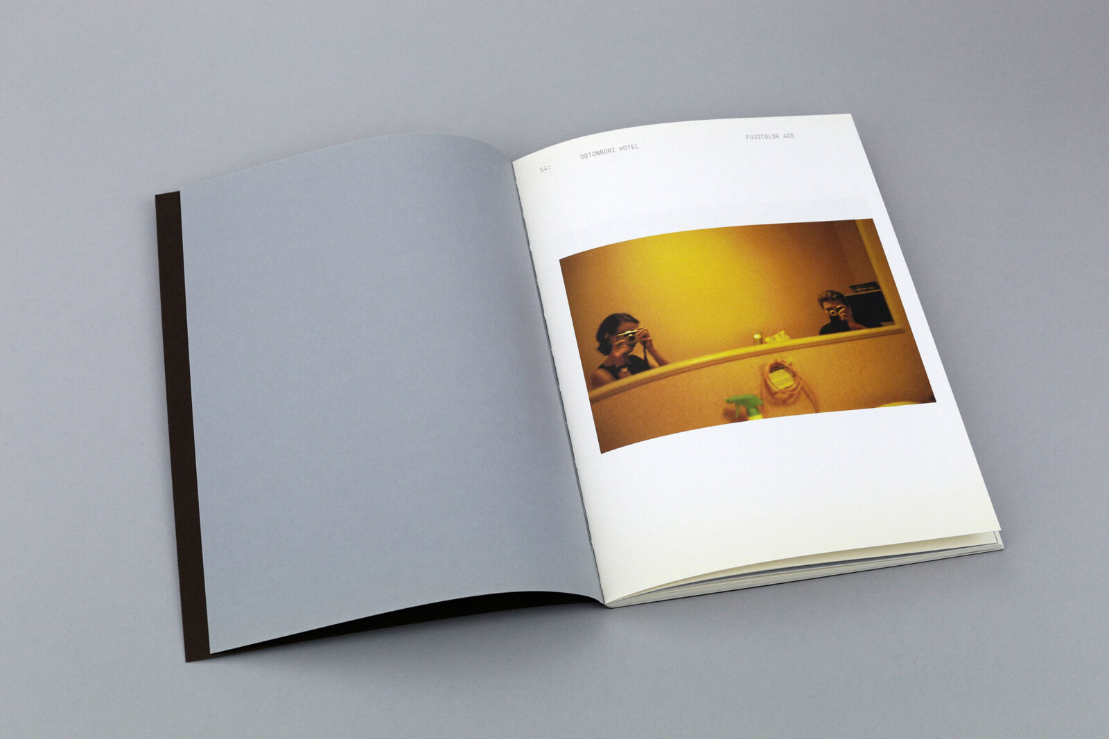
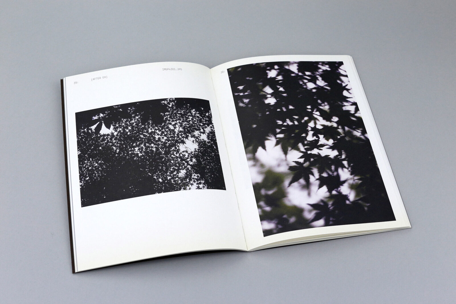
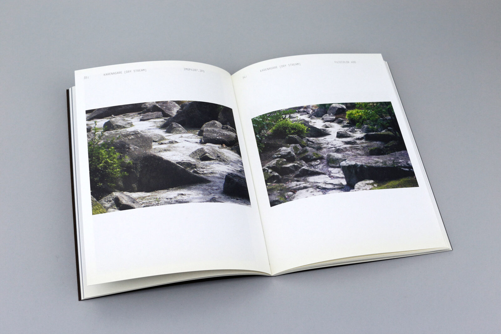
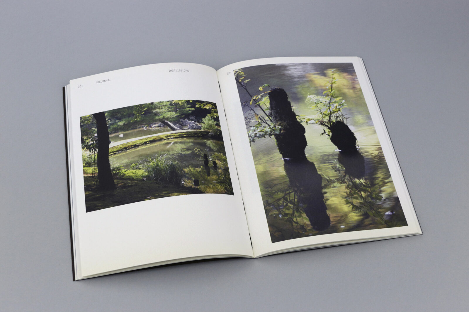
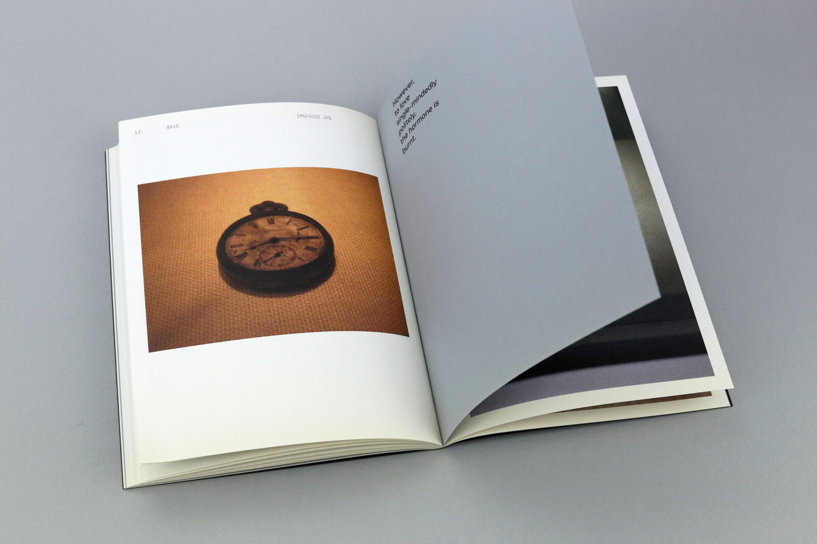
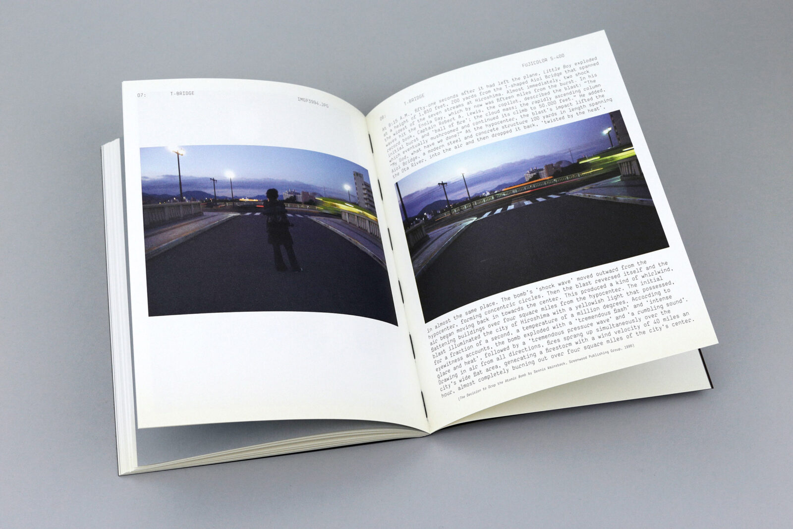
From 2006 until 2008 photographer Sanne Peper worked on a large-scale (book) project in which she explored her fascination with the concept and history of the atomic bomb. She traveled to a number of places, including to Hiroshima and Nagasaki. On the second trip she was accompanied by graphic designer Michaël Snitker, with whom she would later collaborate on the book. In addition to the work she did for her project, she also took numerous snapshots as a kind of diary. Snitker did the same, although in his case it was to gain (visual) access to a culture that is often difficult for us to fathom. Once she had picked up her contact sheets from the lab after a couple of weeks, they realized that they had often shot the very same subjects, albeit in different ways. By editing and pairing these images they achieved a motion and depth that reminded them of old-fashioned stereo photography.
It’s a book about looking and seeing in general, but more specifically about the photographic view. The question was this: what happens when two people with different professional backgrounds look at the same subject, translating it into different images? Sometimes they did that from different positions, often with different focal length, and always with a different medium: Peper shot on negative film with an old Nikon fm2 reflex camera and an analogue Leica Minilux, while Snitker used a digital Pentax Optio and his Samsung telephone. In the end, though, the similarities are more obvious than the differences.
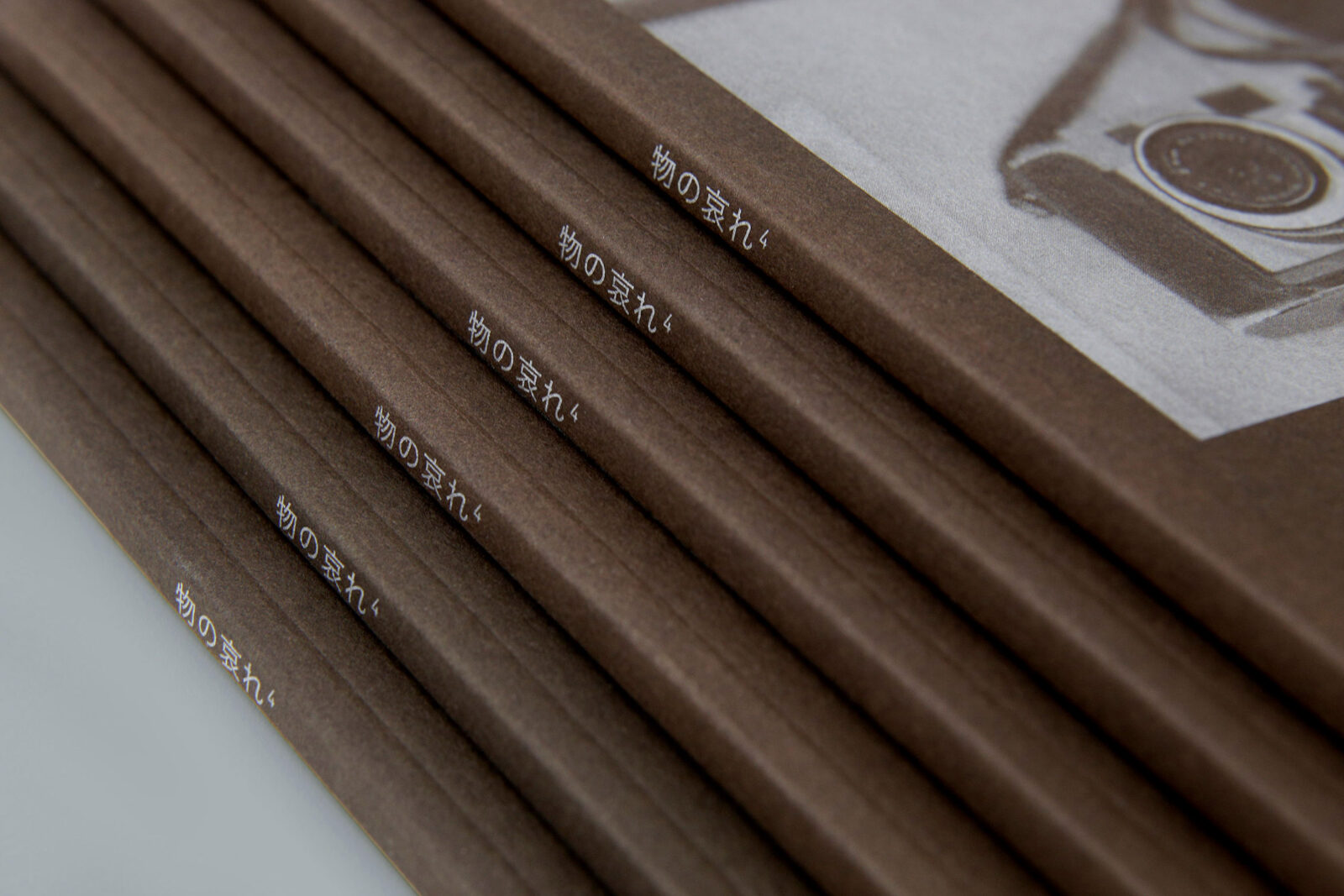
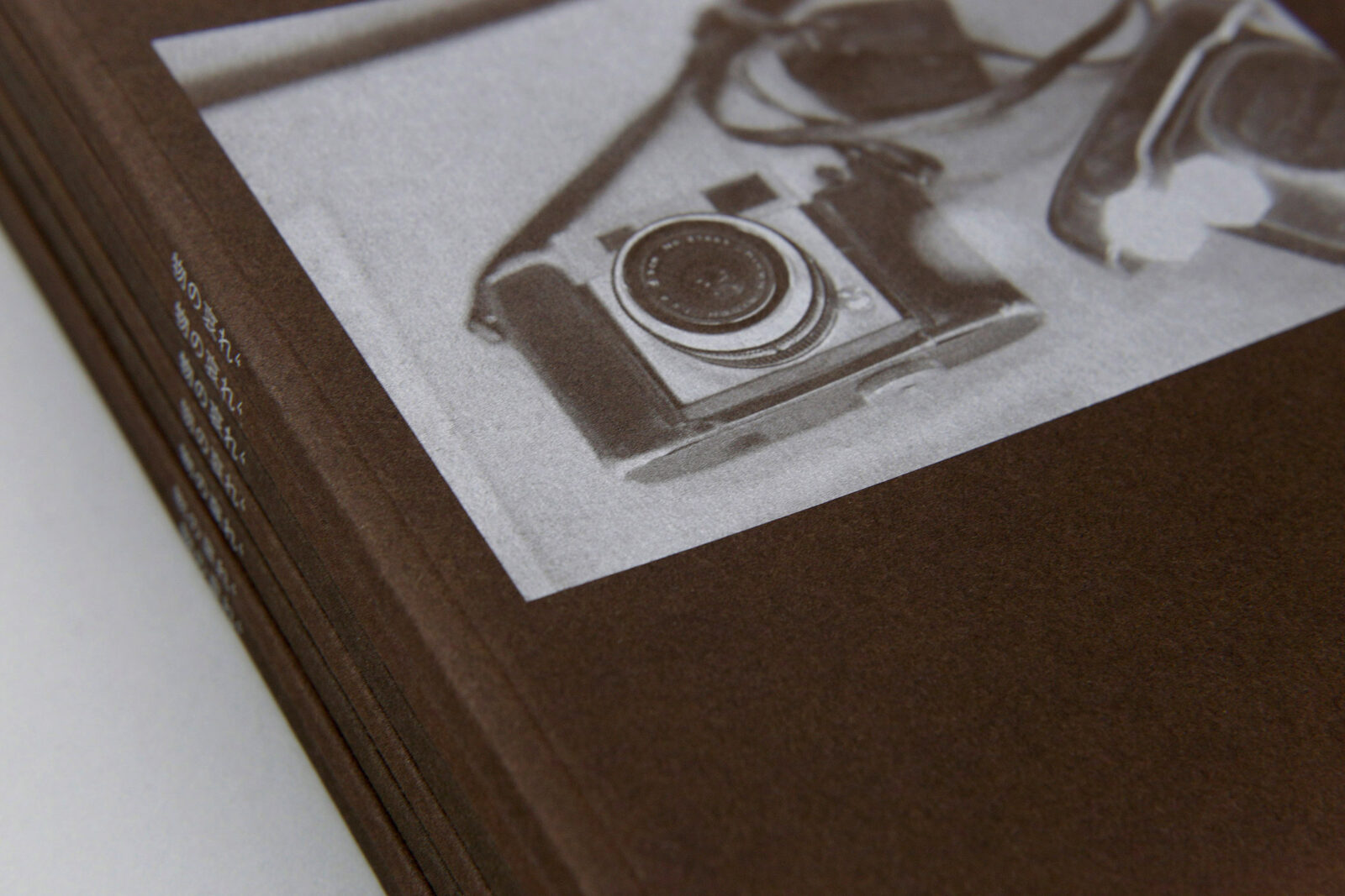
The book consists of 60 pages and reads from back to front. Peper’s images are situated on the recto pages, while Snitker’s are on the verso pages. For the cover they chose paper with the color of tea (Keaykolour Tea), and the ink is silver, which reflects the chemical composition of film. The photo of the Ricoh camera from 1945 on the front cover, which Peper took at the Hiroshima Peace Memorial Museum, was printed in negative. As the silver ink is lighter than the dark paper, however, the image appears in positive. The book called Par.al.lax because their ‘double gaze’ has been translated into a series of diptychs that depict the space in between the images: the visual space as well as the mental one.
This publication was made possible thanks to the financial support of the Netherlands Foundation for Visual Arts, Design and Architecture.
60 pages | 170 × 230 mm | English, Japanese
Self published, 2008
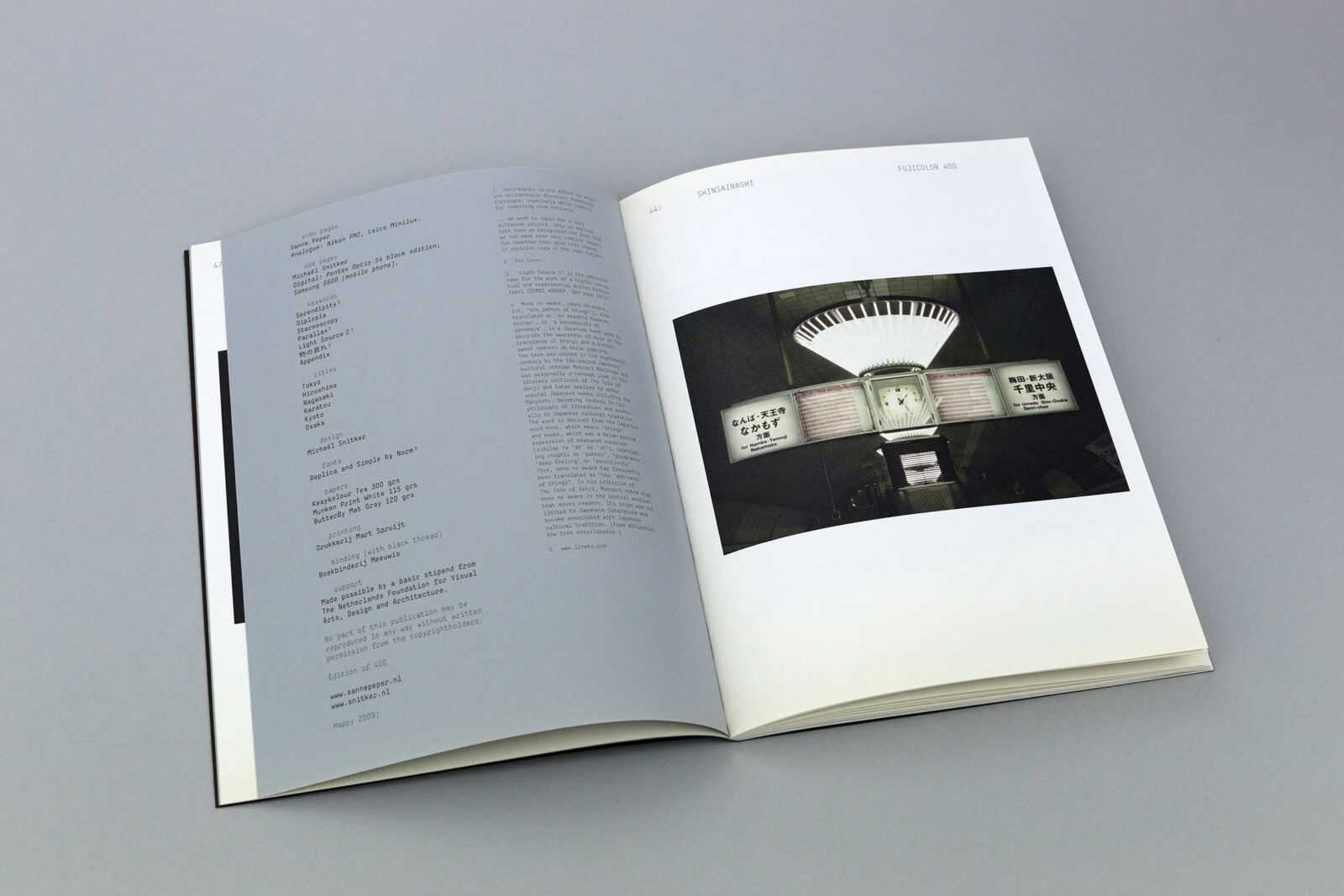
Typefaces: Simple and Replica
Papers: Munken Print White 115 gsm, Butterfly Mat Gray 120 gsm and Keaykolour Tea 300 gsm (cover)
Printer: Mart.Spruijt, Amsterdam
Binder: Patist, Den Dolder
Binding style: Sewn softcover with black sewing thread